Redrawing the Sky
Case Studies | 16 July 2026
Some projects are cool but still feel like work, and then there are projects like this one. Redrawing the 88 constellations of the night sky was a long, complex, technically demanding project well outside my comfort zone (illustration is not where I feel most at home). And yet I never felt like I was working for a single second.
Cosmographies and Other Obsessions
I've had a mild obsession with graphic representations of the world for as long as I can remember. Maps, atlases, diagrams, illustrations… all these images are so many attempts to understand and explain what surrounds us, sometimes poetic, sometimes scientific, often a bit of both at once. A cosmography (that's the fancy word for "descriptive graphic representation of the universe") is never gratuitous or isolated: it is intimately linked to the idea of narrative and to the definition of reality. It is precisely this tension between rigour and storytelling, between science and imagination that has always fascinated me and that has fed my artistic and graphic practice ever since it began.
Because one should never miss an opportunity to make an obsession worse, I wrote my end-of-studies dissertation on this very subject. And to drive the point home, I built my diploma project around the cosmographic and cosmogonic narratives I had collected over the years. What better excuse to put into images the ways of seeing the world that seemed precious and too little known? It was in this context that I first knocked on the door of Milène Wendling (director of the Strasbourg Planetarium), to ask her to proofread some of my popular science texts and ensure the scientific accuracy of my work. Milène agreed, I got my diploma, joy, happiness, academic achievement, and "oh s*** what do I do now?!".
Fast forward a few years, once the joyful chaos of starting out was under control, I asked myself a simple question: if I had the choice, what would I want to work on? The answer being "something to do with astronomy", I wrote to Milène hoping she vaguely remembered me. I subtly landed in her inbox to say, in essence: "Hello, you proofread some texts for my diploma five years ago, would you like to work together on absolutely whatever you want?"
To my great surprise, Milène agreed to meet me again and more than that, she proposed that I redraw all 88 constellations of the celestial vault. Which was the best thing I could have imagined when I knocked on her door. Multiplied by 10.
A Legacy Worth Questioning
Until now, the Planetarium had been using the illustrations from John Flamsteed's Atlas Coelestis, published in 1729. A major work whose quality is beyond question so why redraw them? First, these images posed a concrete problem: some animals are depicted in frightening ways that scare children. And beyond that, they reflect a worldview that the team felt out of step with.

Exemple of illustrations from Flamsteed's Catalogue. Source : Jardin des sciences de Strasbourg
This disconnect is worth pausing on. Representations of the sky are never neutral they reflect the beliefs and values of those who produced them. A cosmography is as much a representation of the sky as it is a portrait of its creator's value system, and through them, of the civilisation they came from. In mapping the sky, we claim it: we project onto it figures that seem important, tracing heroes and mythical characters, celebrating inventions and discoveries. The delimitation of the 88 official constellations is itself the result of several centuries of sedimentation, shaped by Greek, Arab, Indian, Asian and European astronomers.
Like the myths associated with them, representations of the constellations are not fixed objects they have always evolved. Throughout history, each artist has added their own figures, values and obsessions. With the Planetarium team, we found ourselves in the same position as so many before us, with the opportunity to offer our own reinterpretation, and with it its share of questions. What to keep? What to change? To what end?
Drawing for Mediation
In a planetarium, constellation illustrations are tools for mediation before they are graphic works. They serve a dual role: helping the audience identify figures in the night sky, and providing a visual support when educators tell the myths associated with the stars.
This dual role served as our compass for navigating the various choices that came up. The characters' attributes, gestures, and objects depicted: everything was chosen in dialogue with the mediation team, based on what they actually talk about during sessions. Nothing (or almost nothing) is there for purely aesthetic reasons.
Two versions were created for each constellation: one in simple line art, readable without overwhelming the starry background, and one enriched with flat colours and patterns to give body to the figures during storytelling. This dual system allows educators to choose, at the moment they need it, the version best suited to their narrative.

The Orion constellations, simple line drawing (left) and with filling (right)
Down the Rabbit Hole
Before starting to draw, what better way to begin than by diving into an obsessive research spiral? 88 constellations, that's 88 opportunities to fall into a bottomless vortex of Wikipedia pages, ridiculously niche books pulled from the reserves of the local library, and monographs on Gallica. In short, pure joy (everyone has their hobbies, don't judge me).
I eventually emerged from the other end of the tunnel with a first stylistic inspiration: Athenian red-figure vases from classical Greece. A visual anchor that echoes the cultural heritage associated with the majority of constellations in the northern hemisphere.

Examples of red-figure vase paintings (a painting technique invented in Athens around 530 BC): a bell-shaped amphora by the painter Kleophrades (left) and Zeus, a cup signed by Oltos (right). Source : Les vases athéniens à figures rouges : la période archaïque, John Boardman, Thames & Hudson, 1997.
Then begins the joyful chaos of graphic research and various tests. I practise the "throw everything at the wall and see what sticks" technique. Pencils, brushes, cut paper, types of lines, paper and digital support... at this stage, the important thing is not to think too much, to leave space for unexpected ideas, and not to worry about the result. In my experience, it's from a more or less long succession of so-so attempts and questionable tests that the thread of an idea begins to emerge. Then all you have to do is pull on the thread to see if what's at the end is interesting. You filter a little to keep only the most promising leads, then it's off to the planetarium to test them in situ.
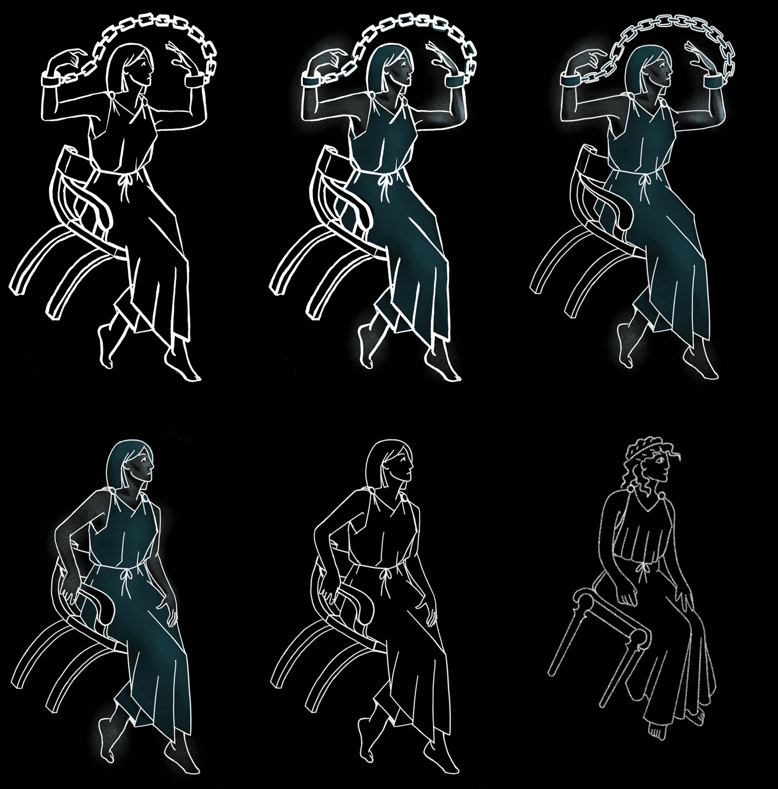
The constellation Cassiopeia, style tests
Try, Adjust, Repeat
The first real-world test session on the planetarium dome was decisive, as it revealed physical realities that would go on to dictate certain graphic choices. For example, the thicker a line, the more light it produces. In the context of projection, this means that a line that is too thick causes light pollution on the sky background (exactly like a streetlamp when you're trying to look at the stars) and dazzles the audience.
Thanks to these initial tests, we were able to settle on line thickness and choose digital drawing over paper.
The subsequent tests raised a second problem. For the first character drawings, I had chosen realistic proportions. I quickly ran into the fact that making realistic figures coincide with lines of astronomical origin produced artificial, stiff poses and promised me many sleepless nights. Along the way, I chose to preserve my sanity and let the style evolve toward more fluid limbs and freer gestures. By embracing a less realistic style, the eye naturally accepts the distortions as a deliberate graphic choice, and the whole thing gives much more life to the figures.

Evolution of drawing style on the constellations of Andromeda (top) and Perseus (bottom)
Right then, nothing left to do but draw 88 constellations like that. Off we go.
This is the moment to tell you about Antoine. Antoine is the planetarium projector programmer, but also the individual of infinite patience who took my [VERY. MANY] drawings and whispered to the projector so it would display them in the right place, who drew reference points one by one to help me adjust pieces of drawings, found a new technical solution to avoid distortion problems caused by projecting my flat drawings onto the curved vault, read obscure books in Dutch to verify information about tiny constellations that nobody knows, and spent as much time as I did spiralling through Wikipedia pages to track down visual references for ancient swords or shields. Thank you, Antoine.
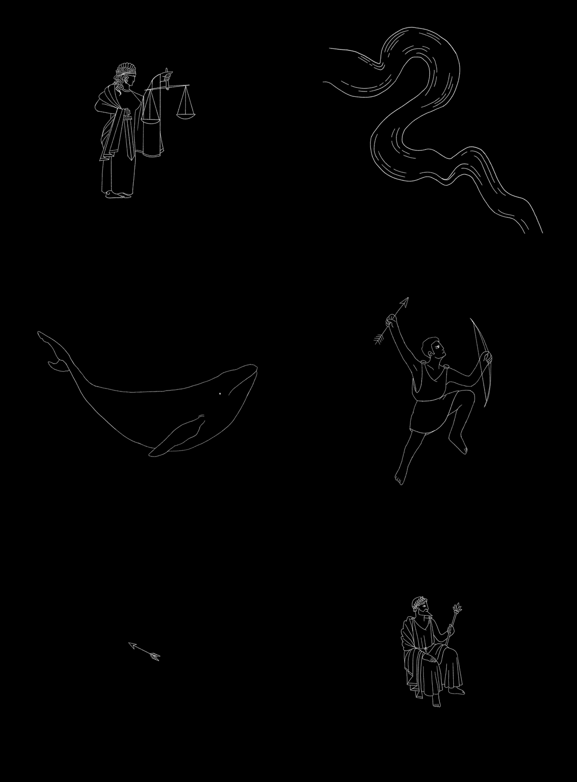
Building a Different Imaginary
Changing Our Gaze on the Living World
The Atlas Coelestis reflects an era when nature was a threatening space to be tamed or conquered. The celestial bestiary is therefore populated with frightening creatures that could make mediation difficult with younger audiences.
Our approach was therefore quite naturally to present nature as a space to be protected. We chose to show animals as beings to be observed rather than feared, with fewer fangs and attacking postures. A shift in perspective on nature that is consistent with what the Planetarium wants to convey: a relationship with the living world built on curiosity and respect.

A comparison between the illustrations in the Flamsteed catalogue (bottom) and the new illustrations (top) of the constellations Leo and Leo Minor (left) and Ursa Minor (right)
Moving Beyond the Male Gaze
The representation of female characters brought with it another point of reflection and an important editorial choice. Greek myths are steeped in rape culture, and their historical illustrators almost exclusively male produced female figures that were nude, passive and sexualised, in line with the representational codes of the Male Gaze (theorised by Laura Mulvey in 1975).
These images, reproduced and shared across generations, have contributed and continue to contribute to normalising a certain way of representing women. They feed into gendered representations in which men are active subjects and women are objects of desire or fantasy.
The new illustrations are made with the intent to break with this pattern. No gratuitous nudity, poses dictated by the narrative rather than by a sexualising gaze, a visual treatment that aims to be consistent across all characters regardless of their gender or role in the story. The slightly naive style then becomes a tool for stepping outside sexualising clichés.

A comparison between the illustrations in the Flamsteed catalogue (left) and the new illustrations (right) of the constellations of Andromeda (bottom) and Cassiopeia (top)
Tearig Up a Little
The northern hemisphere is complete, and we're closing in on the southern hemisphere.
The new illustrations were shown as a preview during the children's sky sessions over the February school holidays. After a year and a half of work, I was able to slip into the room and hear children's reactions to the constellations I had drawn. It's possible I shed a small tear.
The illustrations will be officially unveiled at the Planetarium in the autumn. If you'd like to be kept informed about the special evening we're putting together with the planetarium team, feel free to subscribe to the newsletter ;).
In the meantime, all that's left is to thank Milène for trusting me and for her support throughout this wonderful project, and the entire planetarium team for their enthusiasm!
Alongside this article, I had the pleasure of co-writing a piece with Antoine Grandjean, audiovisual programming officer at the Jardin des Sciences in Strasbourg, for the journal of French-speaking Planetariums.